Updated Theme
Once again, I have replaced the theme of this blog.
Unlike the previous theme, this one is actually one I mostly ended up designing myself rather than just finding one that I mostly liked and running with it, and given that, I figured I’d talk a little bit about the thoughts behind it and how it came to be and what else I’ve done behind the scenes.
The desire to change the theme mostly came about from talking with a friend who is doing a web design course. After talking with them, and looking at some of the course material and playing about with things, I found myself wanting to do some more stuff myself.
I started with wanting to play more with SASS/SCSS and integrating that into some existing sites that I had and reworking the CSS to be SCSS instead. (If for no other reason - Nested CSS is really nice. Hopefully the CSS Nesting proposal will eventually make it’s way to browsers).
After that wasn’t enough, I decided it would be a good chance to play with the design of this site some more.
The old design was an old wordpress theme that I liked at the time and ported to hugo and modified over the years (moving the sidebar to the left not the right, and making it full-width), but was starting to feel a bit dated.

One of the things I’ve wanted to change for a while on this site was the header image. The one I was using before was just a random picture I took in a new datacenter many years ago, and the resolution wasn’t great, and it wasn’t really a good picture. So having recently discovered it, I started looking on unsplash.com for some possible header images and came across one that I liked.
Once I had an image I liked, the next thing was to draw the rest of the owl actually do the rest of
the site.
I like and am familiar with Bootstrap so I continued to use that as a base, and I quickly found myself liking the combination of the new header image and the dark navbar, this inspired me to continue more and I managed to come up with something passable.
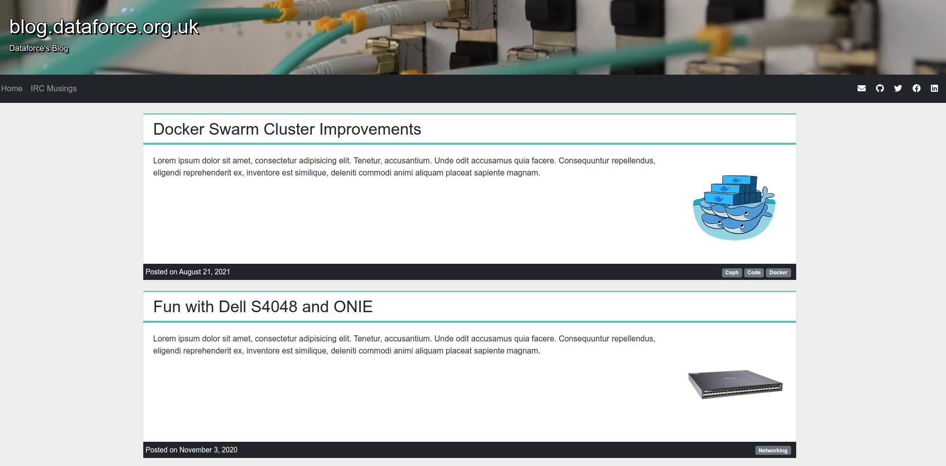
For the new theme I’ve gone for a simpler look, doing away with the sidebar from the old design and focusing more on the actual content.
The social media/contact links are now moved to be unobtrusive icons up in the navbar with the other links moving down to the footer, leaving just the content as the main star of the page.
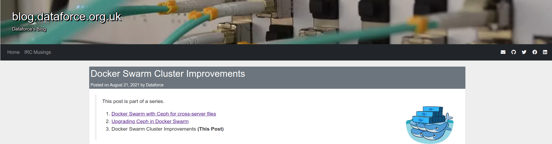
After showing this to some friends, one of the problems that was discovered with this version is that the post-headers weren’t obvious enough - they were too similar to the background and the main post body - there wasn’t enough obvious distinction between two posts.
The first attempts at fixing this involved adding colour to the post-footer:
But that wasn’t enough, so I also tried a couple of varieties of change in the header:
And while these did work, they weren’t quite right. Something still seemed off.
The next thought was that perhaps the header was too noisy - the date didn’t need to be there, and my name is also entirely surplus, so the date was moved to the footer and the name was removed entirely. This didn’t really help much, the header was still lacking.
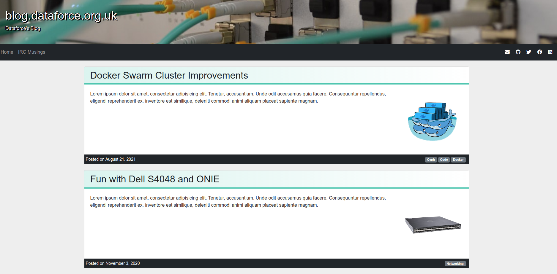
It was then that it was suggested that perhaps an entirely different colour could be used, to avoid just being shades-of-grey. The Aqua from the fibre cables in the header image seemed like a good choice as a “Highlight” colour, perhaps that could be used for the header instead.
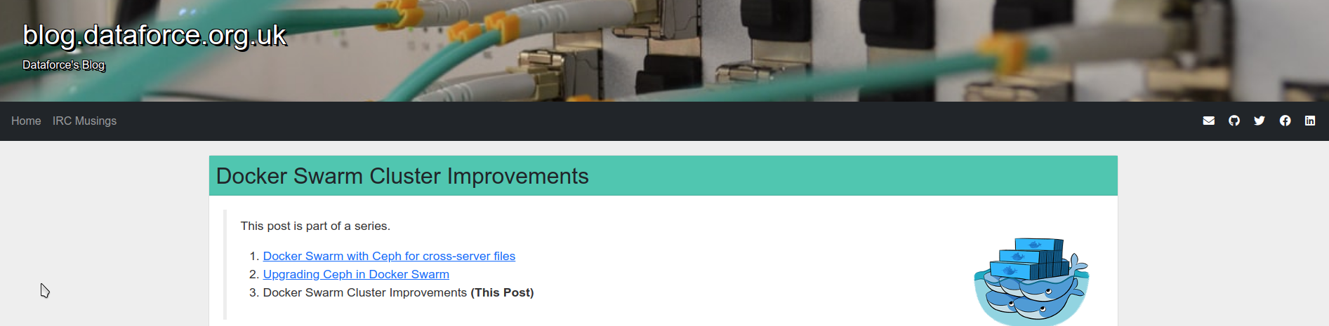
This was starting to feel a bit better. There was now a very distinct start to a post that was obvious when scrolling down the page, but it felt a bit much, so I tried a bit more subtle, using it as an accent rather than a a big blob of colour:
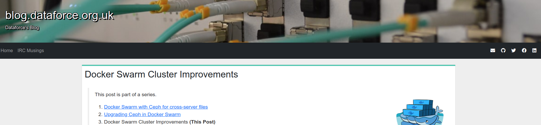
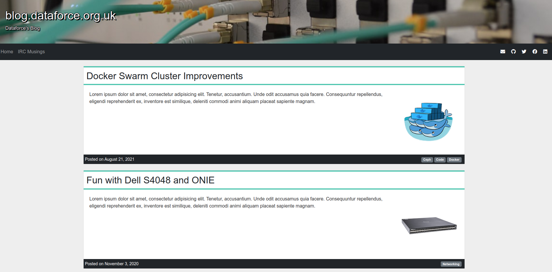

Before eventually settling on the one that I liked:
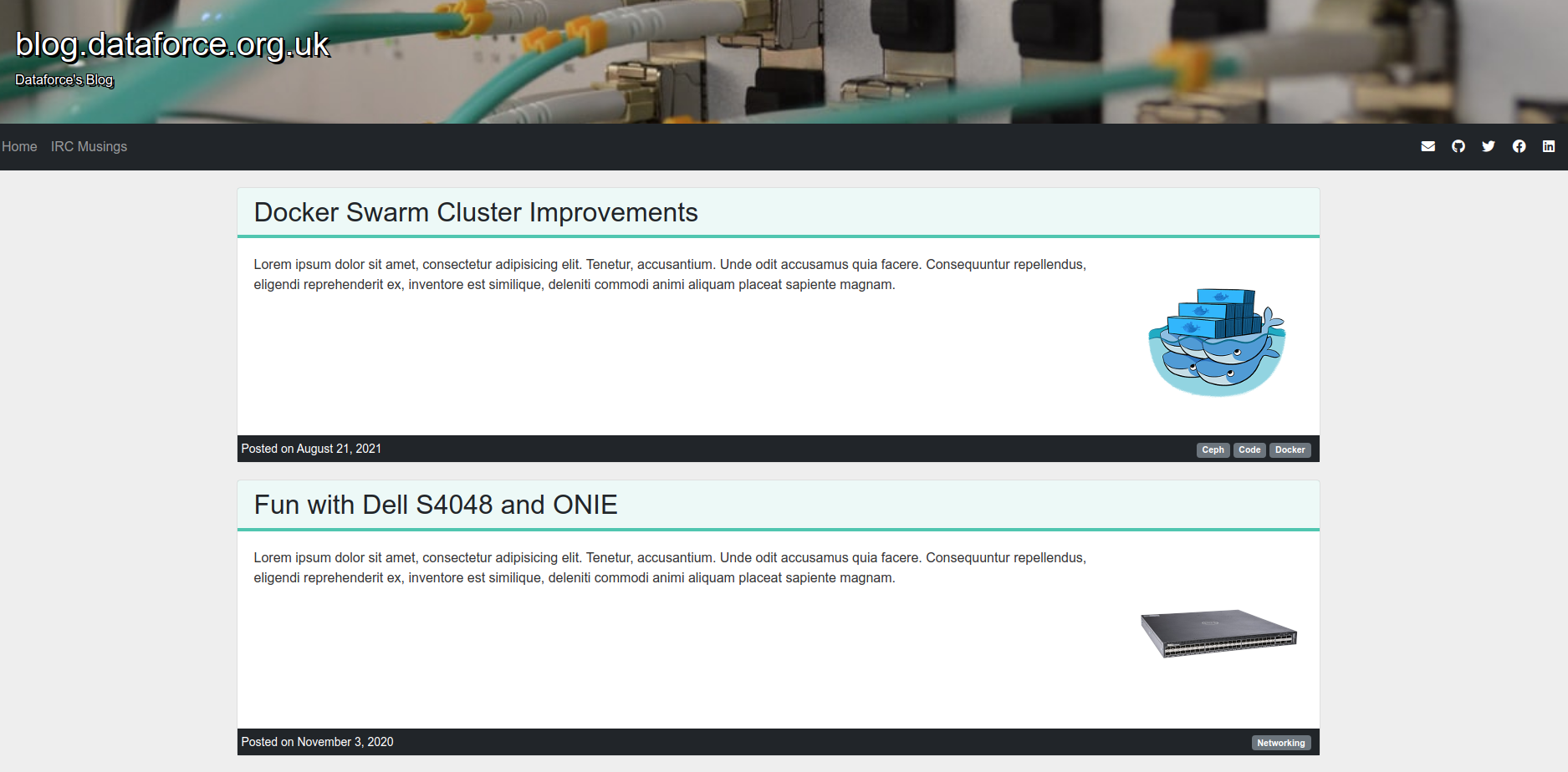
Once I’d settled on this, I started adding the aqua highlight to more of the site - The block quotes, code blocks, links etc all became aqua as well.
I now was at a stage where I really liked how the site was looking.
I spent the next couple of days tinkering with various bits of the layout, such as changing the height of the main page footer (making the links part of the footer, not part of the page body so the footer is taller overall), bringing the navbar and header contents in a bit more (so that they weren’t off to the far-sides while the content was all in the center of the page) and other minor bits.
Another change I made was to switch from full-content posts to only showing the summary of the page and adding a “Continue reading” link. This stops the site feeling so long and arduous to scroll though and surfaces more of the posts to the casual reader.
Once I had the layout all sorted, I turned my attention to some of the behind-the-scenes details.
The site runs from a docker image, and for a long time now, I’ve had some post-processing code that looks at
every page, merges all the styles/javascript together into a single bundle, minifies it and then replaces the
<style> and <script> tags on every page with the bundles. Since I’ve done
that, hugo now supports doing this natively using Hugo Pipes so I
no longer need to do this myself, it’s just
handled as part of the theme now. This is a lot less prone to breakage if I need to add random additional
styles/javascript to a page (such as with Fun with TOTP Codes).
Another change I made was to provide a default image for the opengraph meta tags on a page. These are what allows things like twitter or discord to show a related image when a page is linked
Previously, I only included an image if a post had an image, which resulted in a very sad looking embed for the main page:

So I also added a screenshot of the home page as the default, rather than nothing:

But, this meant I would have to remember to update that screenshot any time I updated the site… what if I could automate this?
Turns out, this is very doable, I just needed to add an extra stage to my Docker build that ran puppeteer and grabbed a quick screenshot and saved it into the output.
So now that screenshot will be automatically updated any time I make a new post (like this one.)
Finally, the last tweak was to add Dark Mode support, this was fairly trivial because of CSS Variables/Custom
Properties and an appropriate media query to invert some colours. Because I use SCSS for the CSS, I can do
this semi-automatically with invert()
$bodyColor: #eee;
$bodyTextColor: #333;
$postBackground: white;
$highlightTextColor: #212529;

:root {
    --postBackground: #{$postBackground};
    --bodyTextColor: #{$bodyTextColor};
    --bodyColor: #{$bodyColor};
    --highlightTextColor: #{$highlightTextColor};

    @media (prefers-color-scheme: dark) {
      --bodyTextColor: #{invert($bodyTextColor)};
      --highlightTextColor: #{invert($highlightTextColor)};
      --bodyColor: #{invert($bodyColor)};
      --postBackground: #{invert($postBackground)};
    }
}
Which looks like:
I’ll probably tweak it a little (to not be pure black for example) but for getting it done quickly, this worked.
Overall, I think the new theme is a lot better looking and nicer to look at than the old one, and I’m definitely happy with it again.